Embellished Circus

5.31.2007

More Birdie Progress

I finally got all the bird bodies cut and collaged to their backgrounds. Today I went with a contrasting wing. Currently they are all basking in the sun - drying from their most recent acrylic topcoat. Now... on to embellishment. What to do - What to do - My brain is pondering all the folksy possibilities.


5.28.2007

Skinny Fat Book Progress

I started working on my "Skinny Fat Book" Bird Theme today. I have decided to go with my traditional "Folk Theme" that I have been working in most of pieces as of late. I wanted to keep all my 20 pages somewhat the same so I decided to make a template for the main bird.


I want the look and feel of my "Folky Bird" to be Americana - Red, White and Blue... and am still working/thinking about the direction I want to go with that.


I like the shape of the bird - and am now in the process of sizing things out and deciding what my backgrounds/foregrounds will be... as well as the bird itself.


I know it will focus around collage and painting... but I'm also toying with sewing too. Still in the planning stages... but it's coming together.

5.27.2007

bird book pages + egg envelopes


As you can see, I've been working more on the egg pages, adding a little here and there. I figured I would post once more with some process images, and a better image of the little aluminum heart, which doesn't scan so well (so I bounced in more light and photographed it instead, as my dying digital camera decided to come on today!)

The orange egg is one of the samples of the first stage where I got stuck, and then I added some stars, a bird, and more attention to the top of the page. This could become the back later--who knows! It all depends on what happens to the current back, which is still blank!

I think another watercolor wash may be in order. Thanks to everyone who commented on these the first time! I didn't level the colors a lot, but they're really a bit brighter in person. I used a more opaque watercolor than usual on these, so they're not bouncing the light around as much as usual. That's definitely something to keep in mind for the future! I think I like the transparent ones better.

I use royal talens watercolors now. I used to use the expensive tube kind, but that seemed silly when the cake variety are so portable and some in a neat metal box!

Edit: added one more pic in the process... a further attempt at unifying the design!
I killed a whole Sakura glaze pen (black) drawing swirls everywhere whilst watching episodes of Torchwood (spin off of Dr. Who).

This has got to be the craziest book page I've ever worked on!

Meanwhile, I did some envelopes on the egg theme. EGGS!


5.23.2007

Layers - Embellished Circus - ATC Exchange

I enjoyed making these. The background was torn images glued to card stock. Acrylic clear top coat. Then I topped that layer with a light coat of colored acrylic paint. Another top coat of clear acrylic. Finally I added some transparent floral art with sparkles and a transparent word to name the piece. Another coat of clear acrylic. I am very pleased with the finished cards and the layering effects.


5.22.2007

Done Beats Perfect . . . Hmmmm . . .

It's been one of those weekends. I looked at the calendar and realized that I needed to get three sets of ATC's done and in the mail RFN1 if I was going to swap them. Trouble is, two were 6/6 and one was 3/3.

So . . . as I was chasing my tailfeathers and throwing together backgrounds I started thinking. Always a bad sign.

On the one hand, it's good to have some tricks up your sleeve for times when your muse is off having coffee and the well's dry. Good to have motifs and methods that you own because you've done them over and over again.

But at what point does it stop being "your special thing" and start being just a bag of tricks?

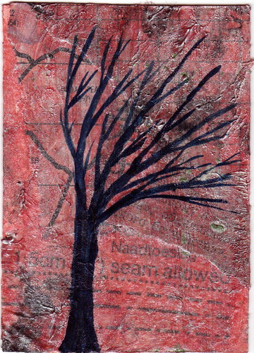
I do backgrounds like no one's business. I have five-six methods for getting marks and color on paper to use for backgrounds that I can do in my sleep. Like here--faux batik.


The swap theme is "Fortune Cookies," so the use of a preprint is ok. It needed something to give it more weight, hence the torn paper background. It's diagonal because it's a cheap way to get a feeling of movement going. (And because I hate to have to line things up just perfectly and true. On a slant can be a smidge off and still look good.)

And here--a haiku swap. As an English major, I can bang out seventeen syllables on the QT. Sometimes they even make sense. And the rhythm of a haiku lends weight to even banal statements, the same way that Yoda-speak, in its foreign flavor, personality imbues the little green handsock with.


And yes, woven backgrounds are one of my go-to's. These colors are so cute and lively, they have kind of a Japanese feeling to me. I like the way this set cut up--the eyes were placed just right to be looking vaguely at the words.

I tried something a little new to me, using coloring book images and searching for backgrounds --realistic backgrounds to place them with.


You can see I gave up on the last picture and used a standard Spike layout--torn scrap art paper placed diagonally (leftover bits of batik) with a central image (the pelican stamp) and a touch of whimsy (the hat sticker).

I was going to send this one:


But I'm not sure if the story reads. I was aiming for "the robin has a red breast because he neglected to use his SUNBLOCK, even though he had it with him." I tend to be a person of the WORD (duh, English major!!) I find myself groping a lot for my visual vocabulary, and wondering if I'm just shouting "Radish transmissions frammitz the tractor, buttercup! Briefcase, booger, buttocks!" Only, in pictures. So it makes even less sense.

Or am I being silly? While some things I do may be just like Kinkaid and his sunbeams, is that such a bad thing? Is "commercial" really a synonym for "overexposed" and "lowest common denomenator"?

Confuscius say:


Hmmmmm.

Spike


1 Right Freakin' NOW

5.21.2007

if wishes grew on trees...

Bare Tree...this tree would have some leaves. Heh.

Here's hoping that when I have time to do art again, I feel like clothing my trees in some foliage. They tell me that they're cold. Poor things.

As for the ATC: I macgyvered the inky layers technique in Bernie Berlin's Artist Trading Card Workshop because I don't own dye ink pads and my pigment ink pads are in Winnipeg. Okay, the pigment ink pads belong to Ptichka...but they're still in Winnipeg. I do own acrylic paint and medium and ink. The background is found paper with ink and acrylics. The tree is all ink.

Labels:

5.19.2007

Skinny Book Progress

I'm also working on my skinny bird pages. These are some of my starter elements here.
I'm also in a "dotty egg" mode! Great minds think alike.

Edit: fixed link

5.16.2007

Happy Feet!

This may qualify more as craft than art . . .

But the socks are finally finished!


Or is that all an artificial distinction??

Does it help if one knows the model is nude except for the socks in question? Could we call it a "mobile conceptual installation with organic components?"


Ah well. Happy feet in their new duds. 'sall good.

5.13.2007

working on that BIRD skinny book thang


SKINNY (FAT) BOOK PAGES:
so i'm working on these pages for the BIRD themed book. i decided that nowhere on the page would i drawn an actual bird. this is pre-bird. or post-bird, depending on how you view that age old argument.

i'm not sure how i feel about them just yet. i feel that something may be missing. i'm going to live with them for a while before i decide. lots of hours of work, and i haven't even started on the backs! these are all different, but i chose to post this particular one because it's my fav. you can see one more in progress over on my livejournal: http://nicci.livejournal.com/

materials: watercolor, dictionary pages, aluminum tape, india ink, hand carved stamp, pigment based ink, gel pen, oil based sharpie, black label tape, tags, & metallic pens on watercolor bristol board.

thoughts? inspirational images to check out? anyone else working on this willing to post progress work? xox

5.07.2007

inspire me thursday

After much hemming and hawing and contemplating, I finally finished something for Inspire Me Thursday. It only took a year! The prompt for this week is foliage and I couldn't resist this tree I came upon during my walk tonight:

foliage

Labels: ,

5.03.2007

fine art valentines - 2007


every year (for the last four years), i've hosted a FINE ART VALENTINE swap, roundabouts january-may, depending on the craziness of the year. sometimes the returns go back in february, but usually they do not.

why? well, the mail art world is a crazy thing, and sometimes i'm willing to wait for what i know is quality work. sometimes i get a little impatient, but it always works out in the end.

this year, 16 sets of valentines were shuffled and made their way back into envelopes to be returned all over the country, and also overseas.

people do all sorts of things from hand carved stamps, to intaglio, to serigraphy. it's really a wonderful sort of experience, with all sorts of skill levels involved. they're little gems of art, and i can't wait for next year!

when i finish scanning all of them, i'll send a link! this is one of my prints from the exchange (i did 2 sets). xox nicci

5.01.2007

ducks in progress


working on the first hand carved stamp in forever. it's about 1.75 inches tall, and each of the duck prints is hand altered with watercolor. the heart is also a mini hand carved stamp.

when finished, these 2x2 inch squares will be affixed to 4x4 inch paper for a valentine. i'll post an image of the finished edition when it's... finished!

xox