pele - serigraph
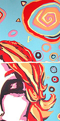
pele - serigraph
Originally uploaded by anongrrl
i have been revisiting screen printing recently. here's the last piece i finished, which i have been thinking of working on. some people like it, some people think it needs more color runs.
this is a reduction method, so the only parts i can currently change are the blue areas. the rest of the screen is painted out. to see how this was done, you can check out the tutorial linked at the bottom of the page. please don't click it until you really consider this piece as is (the original concept drawing appears with it, and might influence your thoughts on this piece if you see it before you consider the question.)
i'm on the fence.
what do you think?
tutorial in the screen filler reduction method
posted by nicci at
17.8.07
![]()


7 Comments:
Ptichka and I have been discussing this and we think the problem is that the tones are too similar. We think that the blue in the background needs to be either lighter or darker. Or even a different colour altogether that's light or dark.
By Zhenia, at 17.8.07
ah, so.
thank you for the input. *grin* i have the screen sitting here, and several prints with which to experiment.
hmmm. it used to be dark purple.
fiddling, fiddling.
By nicci, at 17.8.07
This is mind-boggling to me. So many steps and so much info. I would have to have an hour just to read it all! What an eye-opener!
By Jeanne Rhea, at 18.8.07
hee hee. they don't call printmaking a process driven media for nothing. zomg. so many steps!!
By nicci, at 19.8.07
Comparing the print to its inspiration, I think you've remained true to what was interesting about the original--the lines and shapes. I like your cropping job on the print better than the original.
Zhenia does have a point (but her hair hides it well--JUST KIDDING) your values are all too similar, so the stark lines deliniating the woman have too much weight. Like in a cartoon--the black outlines have a lot of weight.
Does that even make sense?? I've had a really analytical fortnight at work, so my head is tipping sloooowly toward the left . . .
By Spike, at 21.8.07
Can I just say that I really like it without getting all technical??? Which I couldn't do anyway, LOL.
By Judi W., at 26.8.07
absolutely, lol!
i have found some people really like it, and some people are a little freaked out by the blue.
i still haven't decided. but i think i am moving on to other prints because that is the best way to get over a piece you're stuck on, i think!
By nicci, at 4.9.07
Post a Comment
<< Home